Tuesday, October 06, 2009

Holy crap - Sketch time!

I randomly got the image of a zombie silhouetted and wanted to draw it, ended up putting him in front of some kind of blaze/fire. Not 100% satisifed with the form but I'm actually much more pleased with it than I am any of my other photoshop sketches!


The left arm is too bulky, and his legs just aren't right, plus I wanted the whole thing to have a more menacing and hunched over posture to it. But hey, I drew it and that's all that matters these days!

Sunday, March 08, 2009

Revisions to S/W art

A wise artist just told me this week "I always do what the layout editor tells me to do..."

I was asked to alter the various sketches/inks to full 100% ink with no opaque or wash areas. This forced me to alter the look and take out the blur effects. It forced me to reapproach each image with a different view. I also got a chance to alter my original disintegration spell idea with a cooler effect - a black/white body disintegrating into a pile of dust.


Reinked Prismatic Sphere


Original Disintegration Spell


Revised Disintegration

All are digital only.

Thursday, March 05, 2009

More Swords & Wizardry art


Magic Jar spell - sketched on paper, then scanned and redrawn/traced in GIMP with ink tool. I should have started out at about 8"x8" or something similar at 300 ppi - this started at 3x3 and it looked too pixellated. But the shading and smoke turned out nice.

Wednesday, February 25, 2009

Prismatic Sphere


I submitted this (after some assistance by team-preston from the S&W forums) to the S&W team for inclusion in the 2nd printing of the Core Rules. We'll see if it goes anywhere, but if it does, that would be the coolest.

Thursday, February 19, 2009

Grue Sketch

So I was inspired by Chgowiz's sketch of a Grue to not only remember exactly what a Grue IS, but also to draw one. This started as many of my drawings do, as a very small sketch at work that I turned into this slightly less small sketch:


I plan on inking it in photoshop sometime soon, making the background dark for greater effect.

Tuesday, February 17, 2009

Erol Otus Contest - Kobolds


Because I'm probably asking for much embarrassment, I've decided to enter the Erol Otus contest I mentioned in a previous posting. In further attempts to show my lack of skill, I'm going to post sketches and my attempts at using this as a learning experience. I have no real chance of winning, but the point is I'm going to try and learn as much as I can.

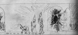
My first step was to come up with a concept - I'm going to go with the "Adventure takes an unexpected twist" category. Kobolds are luring the (apparently really dumb/inexperienced) adventurers into an ambush, by trailing them along with gold coins. Kobolds lurk behind the corner and behind a secret door. Originally, I was going to use a statue to hide behind...
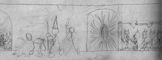

... but after talking it over with my art teacher, I decided that wouldn't work. More kobolds hiding, shifted everything over a bit to avoid dead space and this is close to what I want.

So my first job was to start getting better at sketching something. So I went to my 50 Monsters book for inspiration...
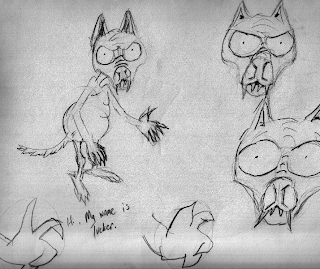


And this is what I came up with as possible kobolds. Yes, his name is Tucker. Oh yes. >:)
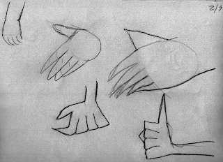

Try to figure out some hands.
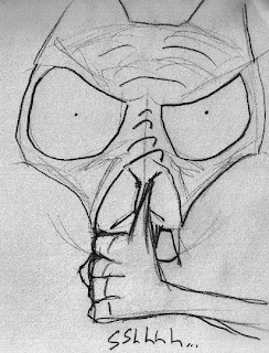
And I'm getting the hang of it.

Pictures Copyright 2009, M Shorten (chgowiz@gmail.com) - All rights reserved

Wednesday, February 11, 2009

Sketches from class: 2/3 and 2/10


Just some values and attempts at flowers. This is from the first class.


This stream scene was from the cover of a magazine called "Ozark Mountains". I couldn't do all the leaves justice, but the overall shapes and much of the values I did get.

Erol Otus contest

There's a big buzz around the old school blogosphere about the Erol Otus contest happening. I think we just got some inspiration for our efforts.

My drawing class continues. I'm learning about "values" and just practicing. I'll scan what I've done soon, it's mainly a lot of value blocks with different pencils and some sketches. I tried to sketch/copy the cover to an Ozark Mountain magazine - a woods/stream scene. It turned out OK. I also learned about "lost and found" outlines.